Creating a drop-down menu using HTML and CSS might seem daunting if you are new to web development, but it can be done quickly and efficiently with the proper steps and tools. With Notepad, even those without prior coding experience can learn how to create a stylish and functional drop-down menu for your website. This tutorial will walk you through the step-by-step process of creating a drop-down menu using HTML and CSS in Notepad. Following our simple guide, you can incorporate a modern and user-friendly drop-down menu into your website in no time.
Today, let’s start learning how to create a drop-down menu with HTML and CSS in Notepad!
Step 1: Create a new HTML file
Create a new HTML file in Notepad by selecting "File" from the top menu and then choosing "Save As." Next, save the file with a .html extension, for example, "index.html".
Copy the following code and paste it into your new HTML file:
<html>
<head>
<title>Drop Down List</title>
</head>
<body>
<!-- a div element to contain the navigation menu -->
<div class="menu">
<!-- an unordered list to create the navigation menu -->
<ul>
<!-- a list item for the "Home" page with an active class -->
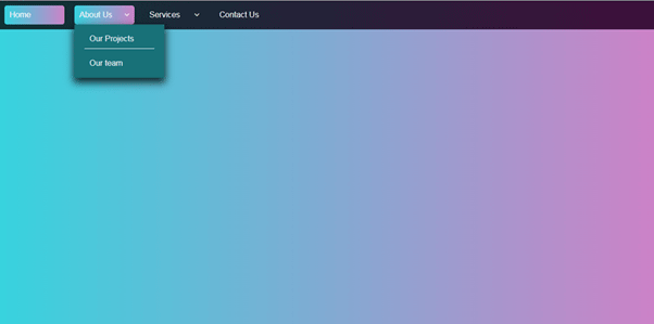
<li class="active"><a href="#">Home</a></li>
<!-- a list item for the "About Us" page with a submenu -->
<li><a href="#"></i>About Us</a></li>
<!-- a list item for the "Services" page with a submenu -->
<li><a href="#"></i>Services</a></li>
<!-- a list item for the "Contact Us" page -->
<li><a href="#">Contact Us</a></li>
</ul>
</div>
</body>
</html>
Output:

Step 2: Set up the CSS File
To set up the CSS file, open Notepad and create a new file. Save the file as a .css extension, such as "style.css". Then, copy the following code and paste it into your new CSS file:
This code will allow you to style your drop-down menu and make it look more visually appealing. Experiment with different styles and designs to make your drop-down menu unique and functional.
/*Structured CSS style sheet with comments:*/
/* Set all padding and margins to zero, and use border-box sizing for all elements */
*{
padding:0; margin: 0;
box-sizing: border-box;
}
/* Set the background to a linear gradient and use specify the font for the entire page */ body{
background: linear-gradient(90deg, #37D3DE 0%, #CC82C7 100%); font-family: Arial, Helvetica, sans-serif;
}
To remove the space between all element's inner and outer boxes, set the padding, margin, and box-sizing properties to zero using the universal selector (*). Negative padding values should not be used.
To style the page's background, set it to a linear gradient using the colours #37D3DE and #CC82C7. Specify the font family as Arial, Helvetica, and Sans-serif.
/* Style the menu container with a linear gradient and align it to the left */
.menu{
background: linear-gradient(90deg, #0D3335 0%, #3E0F3B 100%); text-align: left;
}
/* Style the menu items to be displayed horizontally, remove the list-style, and add margin and padding */
.menu ul{
display: inline-flex; list-style: none;
}
/* Set the width, margin, and padding for the menu items */
.menu ul li{
width: 120px; margin: 10px; padding: 10px;
}
/* Remove the text decoration and set the font color to white for the menu item links */
.menu ul li a {
text-decoration: none; color: white;
}
/* Style the active and hover states of the menu items */
.active, .menu ul li:hover{
background: linear-gradient(90deg, #37D3DE 0%, #CC82C7 100%); border-radius: 5px;
}
The ".menu" selector styles all elements with the class "menu" by setting a left-aligned background with a linear gradient. The menu items are displayed horizontally using "inline-flex" and have their list style removed while margin and padding are added. In addition, each menu item is given a specific width.
To enhance the appearance of the menu item links, their text decoration is removed, and their font color is set to white. In addition, the active and hover states of the menu items are also styled with a linear gradient background and a border radius of 5px. The first menu item is currently active.
Step 3: Creating Sub-Menus
To create a sub-menu for the "About Us" menu item, add a "div" tag with a class of "submenu1" inside the "li" tag for "About Us." Inside this "div" tag, create an unordered list "ul" with two list items "li" for "Our Projects" and "Our team."
<!-- a list item for the "About Us" page with a dropdown icon and a submenu -->
<li><a href="#"><i class="fa fa-angle-down"></i>About Us</a>
<div class="submenu1">
<!-- an unordered list to create the submenu for "About Us" -->
<ul>
<li><a href="#">Our Projects</a></li>
<li><a href="#">Our team</a></li>
</ul>
</div>
</li>
<!-- a list item for the "Services" page with a dropdown icon and a submenu -->
<li><a href="#"><i class="fa fa-angle-down"></i>Services</a>
<div class="submenu1">
<!-- an unordered list to create the submenu for "Services" -->
<ul>
<li><a href="#">Web Design</a></li>
<li><a href="#">Web Development</a></li>
<li><a href="#">UI Design</a></li>
</ul>
</div>
</li>
To create the sub-menu for "Services," follow a similar procedure. Inside the "li" tag for "Services," create a "div" tag with a class of "submenu1". Inside this "div" tag, make an unordered list "ul" with three list items "li" for "Web Design," "Web Development," and "UI Design." The "Web Development" list item has a sub-menu, so create another "li" tag with a class of "next." Inside it, create another "div" tag with a class of "submenu2". Inside this "div" tag, create an unordered list "ul" with two list items "li" for "Front-end Development" and "Back-end Development."
<li class="next"><a href="#"><i class="fa fa-angle-right"></i>Web Development</a>
<div class="submenu2">
<!-- an unordered list to create the submenu for "Web Development" -->
<ul>
<li><a href="#">Front-end Development</a></li>
<li><a href="#">Back-end Development</a></li>
</ul>
</div>
</li>
Step 4: Styling the Drop-Down Menu
Now that we have created our HTML structure for the drop-down menu, it's time to style it using CSS.
To style the drop-down menu using CSS, use the ".submenu1" selector to set the font color to white and hide the first-level submenu items.
/* Hide the first-level submenu items and set the font color to white */
.submenu1{
display: none; color: white;
}
When a user hovers over a menu item, the submenu items are shown using "display: block", positioned absolutely, and given a background color with margins to adjust their position.
/* Show the first-level submenu items on hover, position it absolutely, and add a background color */
.menu ul li:hover .submenu1{
display: block; position: absolute;
background-color: #187178; margin-left: -10px; margin-top: 10px;
box-shadow: 0px 8px 16px 2px rgba(0,0,0,0.8);
}
The submenu items are displayed vertically with margin, border, padding, and left-aligned text.
/* Display the first-level submenu items vertically and add margin */
.menu ul li:hover .submenu1 ul{ display: block; margin: 10px;
}
/* Style the first-level submenu items and add a border and padding */
.menu ul li:hover .submenu1 ul li{ width: 140px;
border-bottom: 1px solid white; padding: 10px;
text-align: left;
}
To accomplish this, use the above CSS code in your stylesheet.
To improve the appearance of the submenu items when hovered over, the CSS code applies a linear gradient background and border radius of 5px. Additionally, the:last-child selector is used to remove the border from the last child of the submenu.
/* Style the hover state of the first-level submenu items */
.menu ul li:hover .submenu1 ul li:hover{
background: linear-gradient(90deg, #37D3DE 0%, #CC82C7 100%); border-radius: 5px;
}
/* Remove the border from the last child of the first-level submenu */
.menu ul li:hover .submenu1 ul li:last-child{ border-bottom: none;
}
The code adds the Font Awesome icon library by linking its CSS stylesheet in the HTML file. Note that the style.css file is also linked inside the <head> tag. To add icons, the <i> element is used. In this case, "fa fa- angle-right" and "fa fa-angle-down" are used for the right arrow and down arrow icons, respectively.
<head>
<title>Drop Down List</title>
<!-- link to the external CSS file -->
<link rel="stylesheet" href="style.css">
<!-- link to the font awesome icon library -->
<link rel="stylesheet" href="https://cdnjs.cloudflare.com/ajax/libs/font-awesome/4.7.0/css/font-awesome.min.css">
</head>
The HTML code includes list items with dropdown and submenu links that use the added Font Awesome icon library.
<!-- a list item for the "About Us" page with a dropdown icon and a submenu -->
<li><a href="#"><i class="fa fa-angle-down"></i>About Us</a>
<!-- a list item for the "Services" page with a dropdown icon and a submenu -->
<li><a href="#"><i class="fa fa-angle-down"></i>Services</a>
<!-- a list item with a right arrow icon and another submenu -->
<li class="next"><a href="#"><i class="fa fa-angle-right"></i>Web Development</a>
The ".fa-angle-right" CSS selector uses the "float" property to position the right arrow icon on the right side of the list item text. Similarly, the ".fa-angle-down" CSS selector is used to place the down arrow icon on the right side of the list item text.
/* Position the right arrow icon to the right */
.fa-angle-right{
float: right;
}
/* Position the down arrow icon to the right */
.fa-angle-down{
float: right;
}
The default submenu2 class is initially set to display-none;, which hides the second-level submenu items by When a user hovers over a menu item with the .next class, the second-level submenu items will be shown by changing the display property to block and position the property to absolute with margins to adjust their position. A background color and box shadow are added to the second-level submenu items for visual effect.
In summary, the styles for the second sub-menu involve showing and hiding elements on hover, positioning them absolutely, and adding a background color, margin, and box shadow.
/* Hide the second-level submenu items by default */
.submenu2{
display: none;
}
/* Show the second-level submenu items on hover, position it absolutely, and add a background color */
.next:hover .submenu2{
position: absolute; display: block; margin-left: 135px; margin-top: -40px;
background-color: #187178;
box-shadow: 0px 8px 16px 2px rgba(0,0,0,0.8);
}
And that's it! Save your HTML and CSS files, and open your "index.html" file in your web browser to see your new drop-down menu.
Creating a drop-down menu using HTML and CSS is a simple and effective way to enhance the navigation and design of your website. With just a few lines of code and the basic text editor Notepad, you can create a professional-looking menu that will make your website more readable and user-friendly.
💡You can view the final result and experiment with the code on this
CodePen project.
Thank you for reading! 🙌 I hope you found this tutorial helpful and that you now feel confident in creating your drop-down menu. Until next time, happy coding! 👋
Author: Paranagama Gedara Sulani Ishara


Comments
Post a Comment